helpful Printing Hints & TERMINOLOGY
What’s a PDF?
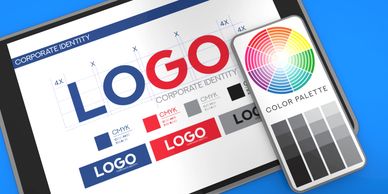
What kind of images work best for printing?
What kind of images work best for printing?

A PDF (Portable Document Format) is the go-to file type for sharing print-ready designs. It keeps your layout, fonts, and images exactly how you intended, no matter what software or computer someone else is using. It’s compact, reliable, and easy to open with free programs like Adobe Reader.
What kind of images work best for printing?
What kind of images work best for printing?
What kind of images work best for printing?

Use high-resolution images—either raster or vector. If you're scanning photos, aim for 300 DPI (dots per inch). Try to avoid using images pulled from the web—they’re usually only 72 DPI, which is great for screens but too low for print. Those images often turn out pixelated or blurry.
What’s a raster image?
What kind of images work best for printing?
What’s a raster image?

Raster (or bitmap) images are made of tiny colored squares called pixels. Formats like .jpg, .png, and .bmp are raster-based. They're perfect for photos and designs with lots of detail. The downside? If you stretch them too much, they can get fuzzy or pixelated.
What’s a vector image?
Why might my printed piece look different from my screen?
What’s a raster image?

Vector graphics are made using lines and curves based on math (don’t worry—your software handles the numbers). These images scale perfectly without losing clarity, so they’re ideal for logos, icons, and illustrations. They’re not great for complex images like photos, but perfect for clean, crisp designs.
Why might my printed piece look different from my screen?
Why might my printed piece look different from my screen?
Why might my printed piece look different from my screen?
What you see on your screen (RGB color) and what gets printed (CMYK color) aren’t exactly the same. RGB uses light (red, green, blue), while printers use ink (cyan, magenta, yellow, black). Some colors in RGB just can’t be printed exactly in CMYK. Always try to design in CMYK to get a more accurate preview of your final print.
Also, every screen is calibrated differently—what looks bright blue on your laptop might look teal on someone else’s.
What are spot colors?
Why might my printed piece look different from my screen?
Why might my printed piece look different from my screen?
Spot colors are pre-mixed inks used for exact, vibrant colors—like metallics or neons—that standard CMYK printing can’t replicate. We use the Pantone Matching System (PMS) to keep these colors consistent. Keep in mind that converting spot colors to CMYK may shift the color a bit, so double-check using a Pantone Bridge guide if color accuracy is critical.
What’s a bleed?
Files too large to upload?
What are crop marks?

A bleed is the extra space (usually 0.125 inch) beyond your design that ensures your artwork runs right to the edge after it’s trimmed. Anything that touches the edge of your design—backgrounds, photos, borders—should extend past the final cut line. Also, keep important text and graphics at least 1/8 inch inside the trim edge so they don’t get accidentally cut.
What are crop marks?
Files too large to upload?
What are crop marks?

Crop marks are thin lines placed at the corners of your file to show the printer where to trim your piece down to its final size.
Files too large to upload?
Files too large to upload?
Files too large to upload?

If your file is too large to email or attach to a form, you can send it through WeTransfer — free and easy. No membership necessary!
How to Send:
- Go to WeTransfer.com
- Click “Send a file”
- Upload your appropriately named file(s) — up to 2GB free
- In the Email to box, enter: emilysprintshoppe@gmail.com
- Add your name, email, and project details in the message box
- Click Transfer
That’s it! We’ll get a notification when your file is received. Files expire after 7 days, so don’t forget to follow up if you don’t hear from us.